
DESIGNING FOR CALM: LAYERED COLOR, LIGHT AND MATERIALS IN A NEW YORK CITY HOME
A calm interior is not a quiet one in the sense of having nothing to say. Achieving a genuine sense of calm at home comes from balancing color and contrast, layering lighting to create moments rather than flat illumination, and choosing materials with enough natural texture to feel grounding rather than sterile. Done well, a soothing space still has depth, warmth, and a point of view; it simply doesn't compete for attention the way a busier room does.
At Studio Ocra, this idea sits close to how we think about design generally. Our studio takes its name from ochre, one of the oldest pigments used by humans, chosen because it carries history, origin, and permanence in a single, quiet tone. That's the balance we look for in every project: history and contemporary design meeting without either one shouting over the other. A calm room, done right, works the same way.

Why Calm and Character Aren't Opposite
The instinct to make a room feel peaceful often leads toward the safest possible choices: all-white walls, minimal furniture, nothing with much personality. The result is usually not calm so much as empty, and empty rooms tend to feel cold rather than restful. Genuine calm comes from a different source: a room where every material, color, and light source has been considered enough that nothing feels like it's competing with anything else. It's editing, not erasing.
Balancing Color and Contrast through the Space
A soothing palette doesn't mean a flat one. The most restful rooms we design usually build from a soft, warm neutral base: plasters, limewashes, and woven textures in tones close to the wall color, and then introduce one or two moments of real depth: a dark walnut console, a dark bronze fixture, a single upholstered piece in a deeper, more saturated tone. That contrast is what keeps the eye moving through the room instead of going flat the moment you walk in. The goal isn't the absence of color; it's tonal discipline: every color in the room related to the others, so contrast reads as intentional rather than accidental.
Lighting Design that Creates Moments, not just Illumination
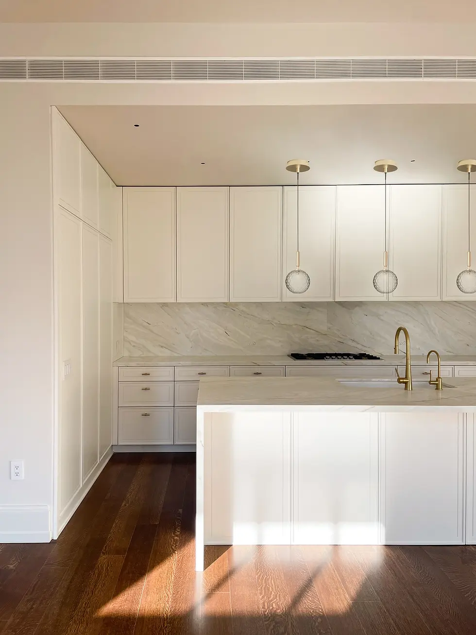
Lighting does more to shape how calm a room feels than almost any other decision, and it's the one most often treated as an afterthought. A single central fixture flattens a room and every texture in it. Layered lighting with a mix of ambient, task, and accent sources at different heights, on separate dimmers, lets a room shift through the day the way natural light does, and lets you choose where attention goes in the evening: a sconce grazing a plaster wall to bring out its texture, a low pendant pooling light over a table rather than flooding the whole room. Warm color temperature matters as much as placement; even a beautifully designed room reads as cold and clinical under the wrong bulb. The goal is light that behaves like it has a source and a purpose, not light that simply fills space.

Material Texture that Feels like Nature
Texture is where a calm room earns its warmth. Natural materials, like white oak, honed stone, linen, wool, raw plaster, and unlacquered brass that's allowed to patina, read as grounding in a way that smooth, uniform, factory-perfect surfaces don't, because they carry the small irregularities of the material they came from. That variation is what makes a room feel lived-in rather than staged, and it's also what gives a space a sense of belonging: materials that age and change alongside the people living with them, rather than staying frozen in a single showroom moment.
Where Studio Ocra's Approach Comes in
This is close to the core of how we design every project, not just the ones aiming specifically for a calm mood. Our work is built on the belief that a home should feel lived in, loved, and lasting, and that craftsmanship and sustainability are part of the same conversation as beauty. In practice, that means specifying materials that will hold up and develop character over decades, not just look good in the first year, and designing lighting plans alongside finishes from the start rather than layering them on at the end. You can see this approach across our portfolio of Brooklyn and Manhattan projects, where the calmest spaces are also often the most detailed once you look closely.

Frequently Asked Questions
What colors make a room feel calm without being boring?
Soft, warm neutrals as a base, plaster tones, warm whites, sandy beiges paired with one or two deeper, more saturated colors or materials. Calm comes from tonal harmony, not from avoiding color altogether.
How do you layer lighting for a soothing but functional space?
Combine ambient, task, and accent lighting at different heights on separate dimmers, using a warm color temperature throughout. Avoid relying on a single central overhead fixture, which flattens both the light and the textures in the room.
What are the best natural materials for a cozy, high-end interior?
White oak, honed or leathered stone, linen, wool, lime wash or Marmorino fine plaster, and unlacquered brass are reliable choices. Their natural variation and ability to patina over time are what create warmth and a sense of belonging in a space.
Can a room have contrast and still feel calm?
Yes, and it usually needs to. A palette with no contrast at all tends to read as empty rather than peaceful. The key is keeping contrast intentional and tonally related, rather than introducing colors or materials that feel disconnected from the rest of the room.
If you're planning a renovation and want a home that feels calm without feeling flat, we'd love to talk about how thoughtful color, lighting, and material choices can shape the space from the start.


Comments